Seaworthy Kitchen + Bar
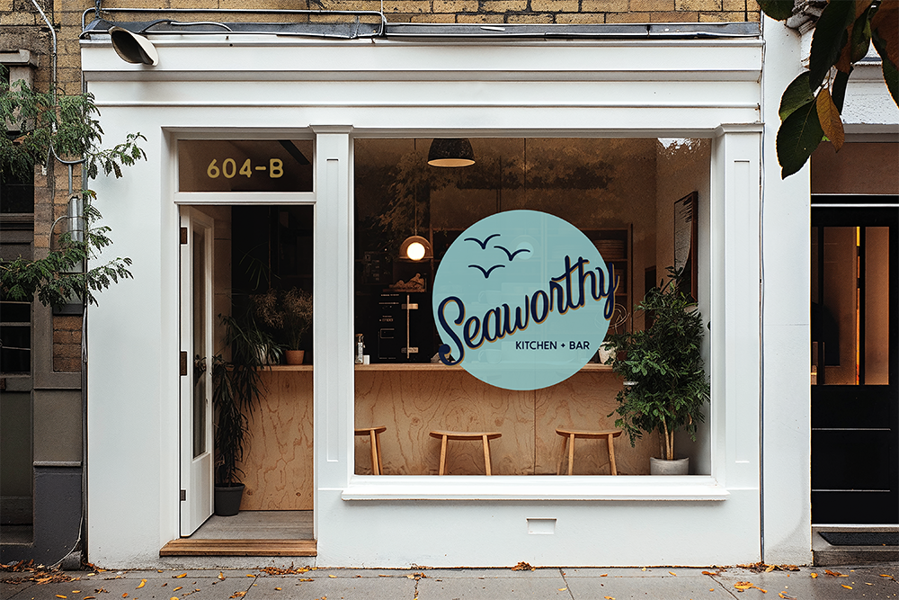
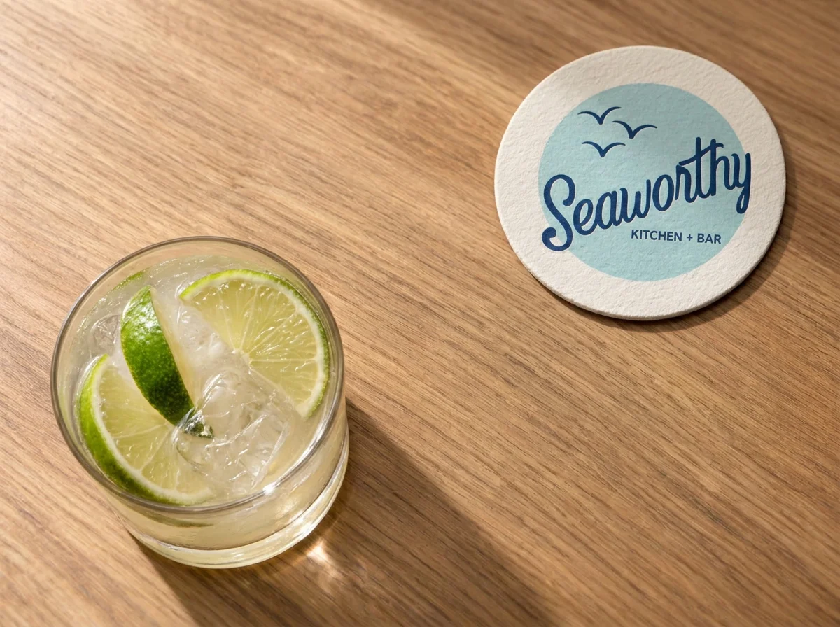
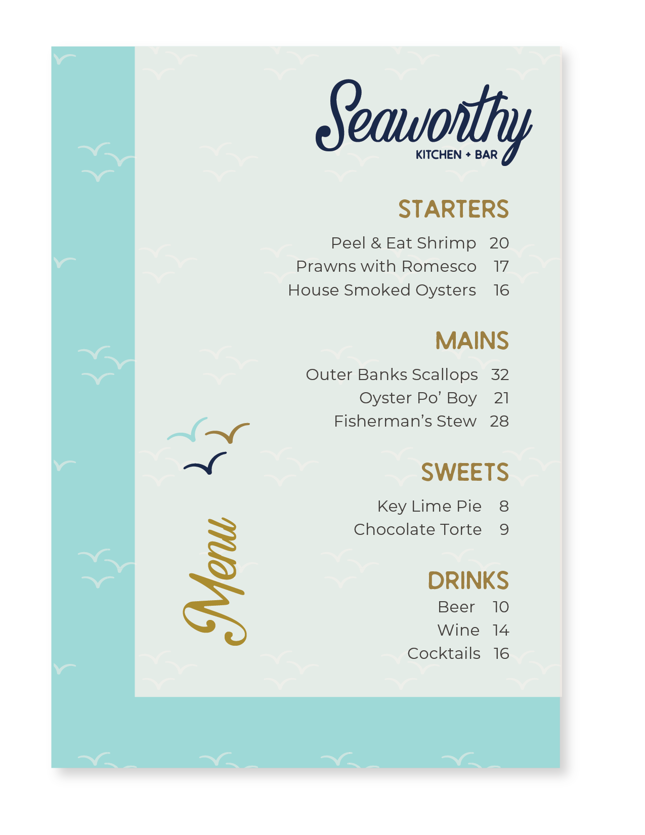
Identity: Classic coastal charm + modern sophistication.
A customized script font brings a sense of nostalgia and relaxed elegance, balanced by clean, understated typography for a polished, contemporary feel. Subtle bird motifs evoke the ease of life by the water, while a palette of deep navy, sea-glass aqua, warm bronze, and soft neutrals creates a fresh, distinctly coastal look without relying on nautical clichés. Together, these elements create a brand that feels elevated yet approachable, with a relaxed coastal vibe and a character all its own.
A Study in First Impressions
South Slope Acupuncture & Wellness
Identity: Professional and approachable meets balance and ancient knowledge.
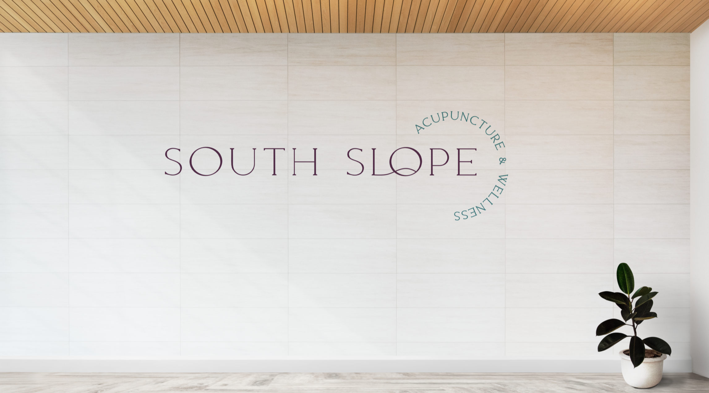
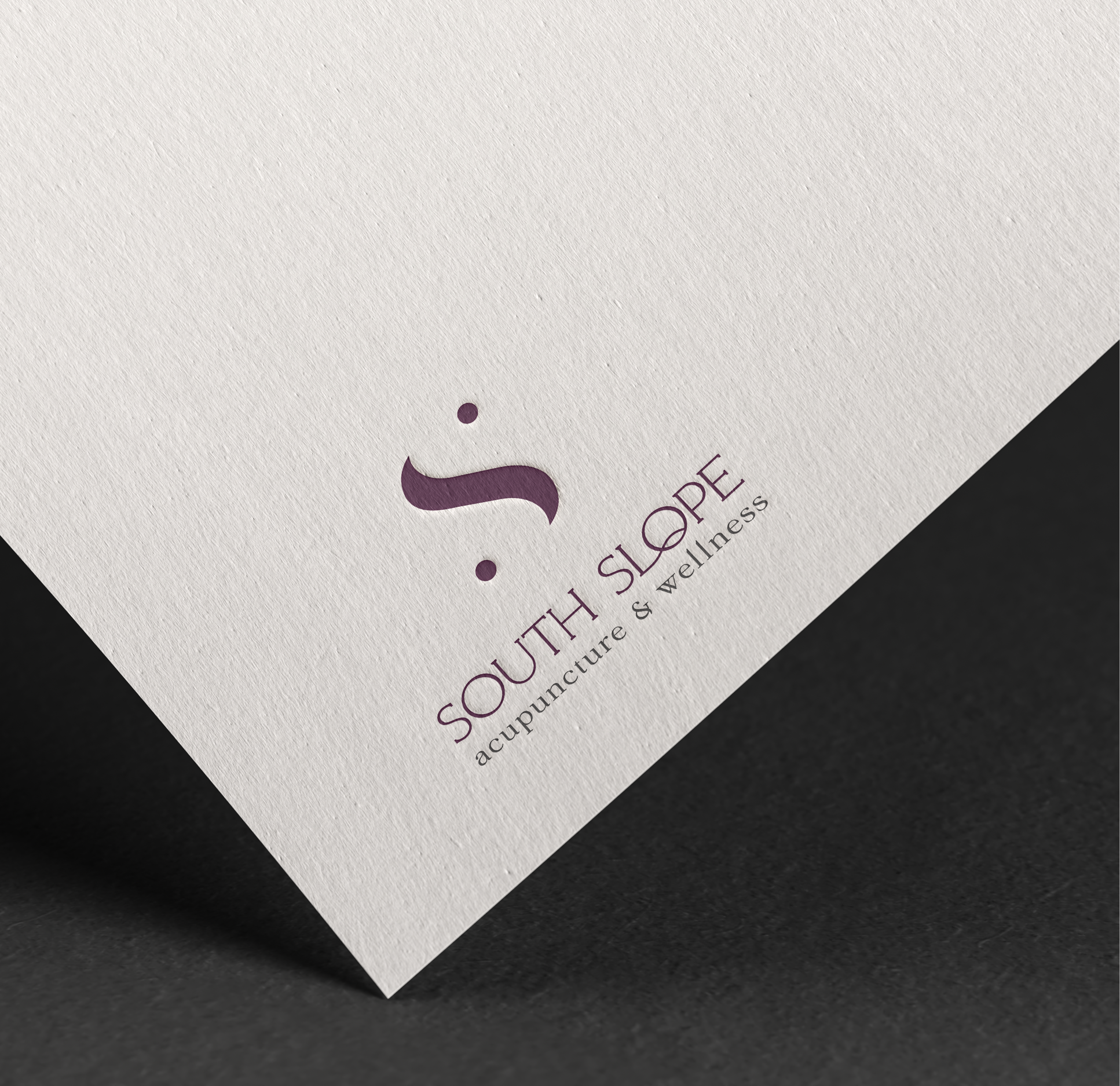
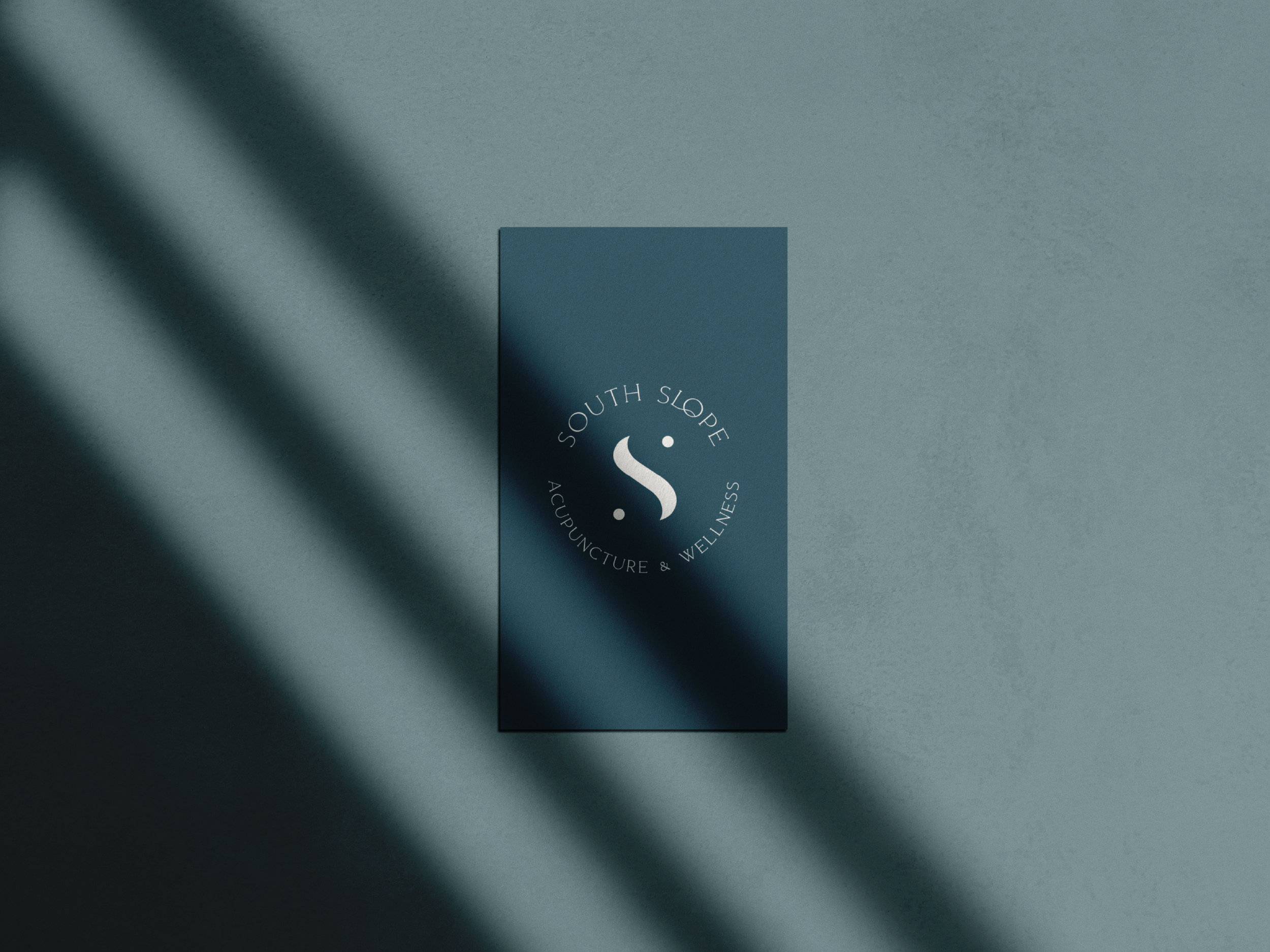
A fresh perspective on acupuncture and wellness. At the center of the brand, a custom “S” symbol creates a distinctive mark, paired with elegant, understated typography and a rich palette of plum and teal. Designed to stand apart from the typical acupuncture clinic, the brand embraces a contemporary aesthetic with a subtle nod to the yin-yang concept—balancing the familiar with the unexpected. The aim was sophistication with approachability, creating a look that feels professional, welcoming, and distinctly its own—challenging traditional acupuncture aesthetics in favor of a more accessible approach to wellness.